
Table of Contents
AngularJS was completely based on controllers and the view communicates using $scope whereas Angular 2+ is 100% a component-based approach. The Angular component allows us to provide a way for styling the component. This means that we can provide different CSS styling, rules, and other device-specific style configuration for a specific component. For that, the Angular component has metadata properties based on your different needs and requirements.
In this post we’ll cover the following topics:
What is Component in Angular?
Components are the most basic building block of a UI in an Angular application. They are directives with a special decorator (@Component) and template. Component decorator allows you to mark a class as an Angular component and provide additional metadata that determines how the component should be processed, instantiated, and used at runtime. Below is an example of a component:
import { Component } from '@angular/core';
@Component({
  selector: 'app-root',
  templateUrl: './app.component.html',
  styleUrls: ['./app.component.css']
})
export class AppComponent {
  title = 'AngularComponentLibraries';
}
This is the main app-component that is created by default for Angular applications. This component can be used anywhere in the template like this <app-root></app-root>. The templateUrl specifies the part to the component’s template, the styleUrls specify the part to the component’s style. In the index.html file, <app-root> tag corresponds to the component’s selector. By doing so, Angular will inject the corresponding template of the component.
<!doctype html>
<html lang="en">
  <head>
      <meta charset="utf-8">
      <title>AngularComponentLibraries</title>
      <base href="/">
      <meta name="viewport" content="width=device-width, initial-scale=1">
      <link rel="icon" type="image/x-icon" href="favicon.ico">
      <link rel="preconnect" href="https://fonts.gstatic.com">
     <link href="https://fonts.googleapis.com/css2?family=Roboto:wght@300;400;500&display=swap" rel="stylesheet"
<link href="https://fonts.googleapis.com/icon?family=Material+Icons" rel="stylesheet">
  </head>
      <body class="mat-typography">
            <app-root></app-root>
       </body>
</html>
What is a Component Library?
A component library is a collection of pre-designed parts of a website or pre-coded parts of the software. Designers can directly add the component to their app, avoiding the need to code everything from scratch. It helps designers to work in a consistent way and becomes very time efficient when executed correctly. Many UI component libraries also provide customizable features. Thus, developers can have the flexibility to be creative and customize or create new components.
Look to Hire Angular Development Team?
Share the details of your request and we will provide you with a full-cycle team under one roof.
User Interface makes the first impression about your application on users’ minds. A good User Interface encourages the user to use the application more and more. Users interact with an application using different platforms like PCs, Mobile Devices, and Tablets. So User Interface is the critical part of both web and mobile applications.
You can develop a responsive User Interface on your own, but it takes time to develop all the responsive UI components. Instead of developing the UI Components manually, you can use external UI component libraries, which are efficient, responsive, and easy to use. With the increasing popularity and better community support, Angular also has some excellent UI component libraries which you can use to make a better User Interface of Angular Application.
Top Angular Component Libraries
Angular is a massive framework that has many functionalities and utilities. It has many built-in libraries that make it easier for developers to work. Core libraries like RxJS come pre-installed in the Angular-CLI project. It also has many API-specific and frontend-specific libraries.
But having too many integrated libraries can make it unnecessarily heavy. Having too many incorporated web components- that developers rarely use- can make working very slow and tedious.
But it is also hard for developers to use Angular if they have to rewrite codes for each small function. It is also pertinent to allow space for creativity and customization to a user. Therefore, Angular has created Angular Material to provide external components for users. Apart from this, there are vast numbers of UI components libraries for you to choose from, such as Onsen UI, NG Zorro, NG Lightening, and Vaadin Components.
Using an external Angular component library can make the development process time and cost-efficient for companies. Here we have made a list of the best angular UI component libraries that you can use in your Angular projects.
Angular Material:
Angular Material consists of a collection of Material Design components that we can easily integrate within Angular applications. It follows the best UI practices including adding the new feature promptly from command line templates.
Let’s use Angular Material in our Angular Application.
Using the Angular CLI ng the add command will update your Angular project with the correct dependencies, perform configuration changes and execute initialization code.
ng add @angular/material
The ng add command will install Angular Material, the Component Dev Kit (CDK), Angular Animations and ask you the following questions to determine which features to include:
-
Choose a prebuilt theme name, or “custom” for a custom theme:
You can choose from prebuilt material design themes or set up an extensible custom theme.
-
Set up global Angular Material typography styles:
Whether to apply the global typography styles to your application.
-
Set up browser animations for Angular Material:
Importing the BrowserAnimationsModule into your application enables Angular’s animation system. Declining this will disable most of Angular Material’s animations.
Let’s display a slider component in your app and verify that everything works.
You need to import the MatSlideToggleModulethat you want to display by adding the following lines to your app.module.ts file.
import {MatSlideToggleModule} from '@angular/material/slide-toggle';
@NgModule({
declarations: [
      AppComponent
],
imports: [
    …,
     MatSlideToggleModule
  ],
  providers: [],
  bootstrap: [AppComponent]
})

export class AppModule { }
Add the<mat-slide-toggle> tag to the app.component.html like so:
<mat-slide-toggle>Slide me!</mat-slide-toggle>
Run your local dev server:
ng serve
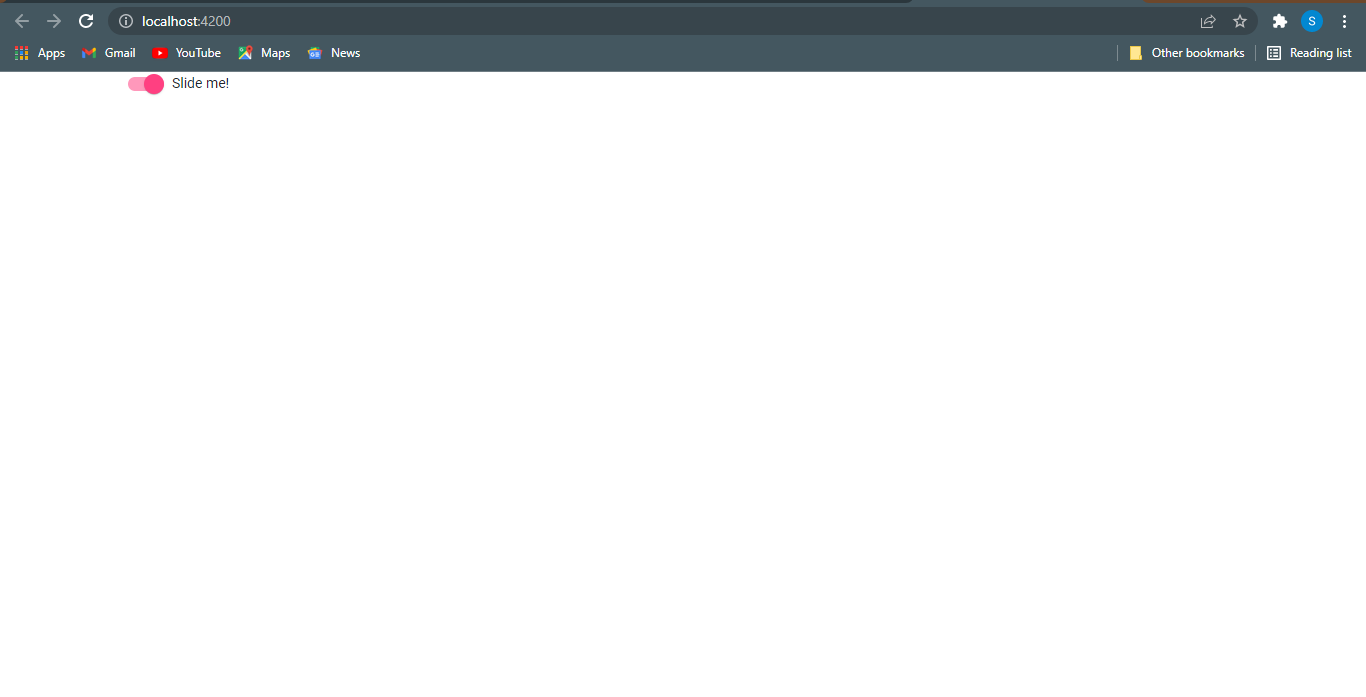
Then point your browser to http://localhost:4200. There are plenty of different components available on angular-material.
You should see the Material slide toggle component at the top left corner of the page.
NG-Bootstrap:
NG-bootstrap, a very popular Angular Bootstrap component library, was developed in 2015. NG Bootstrap provides Angular widgets built from the ground up using Bootstrap 4 CSS. These widgets are accessible and easy to use, requiring no external learning other than Angular and Bootstrap. This Angular library has the backing of a strong team of developers.
It gives access to the Bootstrap components like a carousel, modal, popover, date picker, and typeahead. But over time, its usage has been decreasing due to a long time between updates.
To install ng-bootstrap in our Angular project we need to run the following command:
ng add @ng-bootstrap/ng-bootstrap
It will install ng-bootstrap for the default application specified in your angular.json and import NgbModule from ng-bootstrap in app.module.ts.
import { NgbModule } from '@ng-bootstrap/ng-bootstrap';
@NgModule({
declarations: [
      AppComponent
  ],

  imports: [
         …,
         NgbModule
  ],
  providers: [],
  bootstrap: [AppComponent]
})
export class AppModule { }
Let’s verify whether ng-bootstrap is working fine or not by creating a navigation in app.component.html as follows:
<div class="container">
<ul ngbNav #nav="ngbNav" [(activeId)]="active" class="nav-tabs">
     <li [ngbNavItem]="1">
         <a ngbNavLink>One</a>
             <ng-template ngbNavContent>
                   <p>Raw denim you probably haven't heard of them jean shorts Austin. Nesciunt tofu stumptown aliqua, retro synth master cleanse. Mustache cliche tempor, williamsburg carles vegan helvetica. Reprehenderit butcher retro keffiyeh dreamcatcher synth. Cosby sweater eu banh mi, qui irure terry richardson ex squid. Aliquip placeat salvia cillum iphone. Seitan aliquip quis cardigan american apparel, butcher voluptate nisi qui.</p>
            </ng-template>
     </li>
     <li [ngbNavItem]="2">
         <a ngbNavLink>Two</a>
            <ng-template ngbNavContent>
                <p>Exercitation +1 labore velit, blog sartorial PBR leggings next level wes anderson artisan four loko
                    farm-to-table craft beer twee. Qui photo booth letterpress, commodo enim craft beer mlkshk aliquip
                    jean shorts
                    ullamco ad vinyl cillum PBR. Homo nostrud organic, assumenda labore aesthetic magna delectus mollit.
                 Keytar
                    helvetica VHS salvia yr, vero magna velit sapiente labore stumptown. Vegan fanny pack odio cillum
                    wes anderson
                    8-bit, sustainable jean shorts beard ut DIY ethical culpa terry richardson biodiesel. Art party
                    scenester
                    stumptown, tumblr butcher vero sint qui sapiente accusamus tattooed echo park.</p>
            </ng-template>
     </li>
     <li [ngbNavItem]="3">
         <a ngbNavLink>Three</a>
            <ng-template ngbNavContent>
                <p>Sed commodo, leo at suscipit dictum, quam est porttitor sapien, eget sodales nibh elit id diam. Nulla facilisi. Donec egestas ligula vitae odio interdum aliquet. Duis lectus turpis, luctus eget tincidunt eu, congue et odio. Duis pharetra et nisl at faucibus. Quisque luctus pulvinar arcu, et molestie lectus ultrices et. Sed diam urna, egestas ut ipsum vel, volutpat volutpat neque. Praesent fringilla tortor arcu. Vivamus faucibus nisl enim, nec tristique ipsum euismod facilisis. Morbi ut bibendum est, eu tincidunt odio. Orci varius natoque penatibus et magnis dis parturient montes, nascetur ridiculus mus. Mauris aliquet odio ac lorem aliquet ultricies in eget neque. Phasellus nec tortor vel tellus pulvinar feugiat.</p>
          </ng-template>
    </li>
</ul>
<div [ngbNavOutlet]="nav" class="mt-2"></div>
</div>
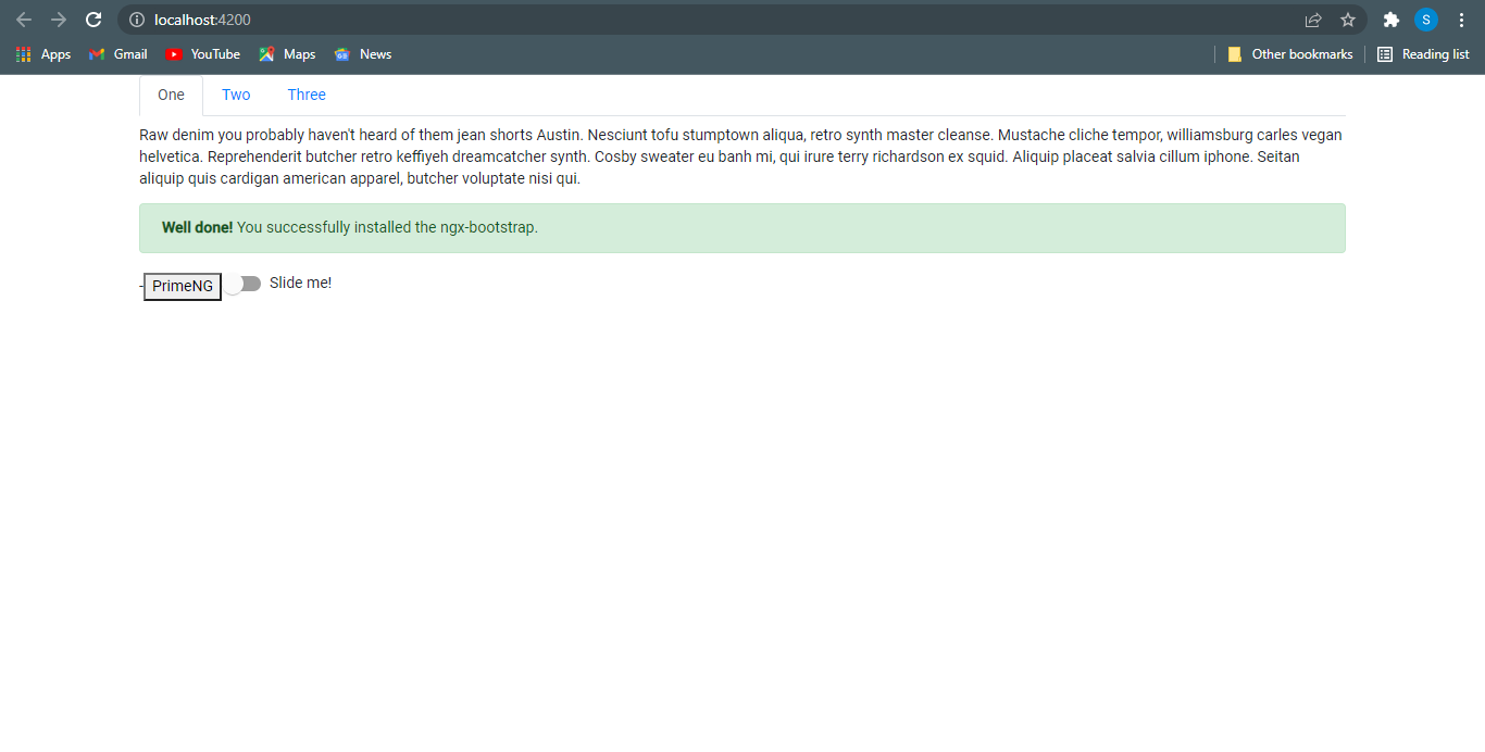
This is working fine and ensuring that we are all done with ng-bootstrap installation. Now our application looks as follow:
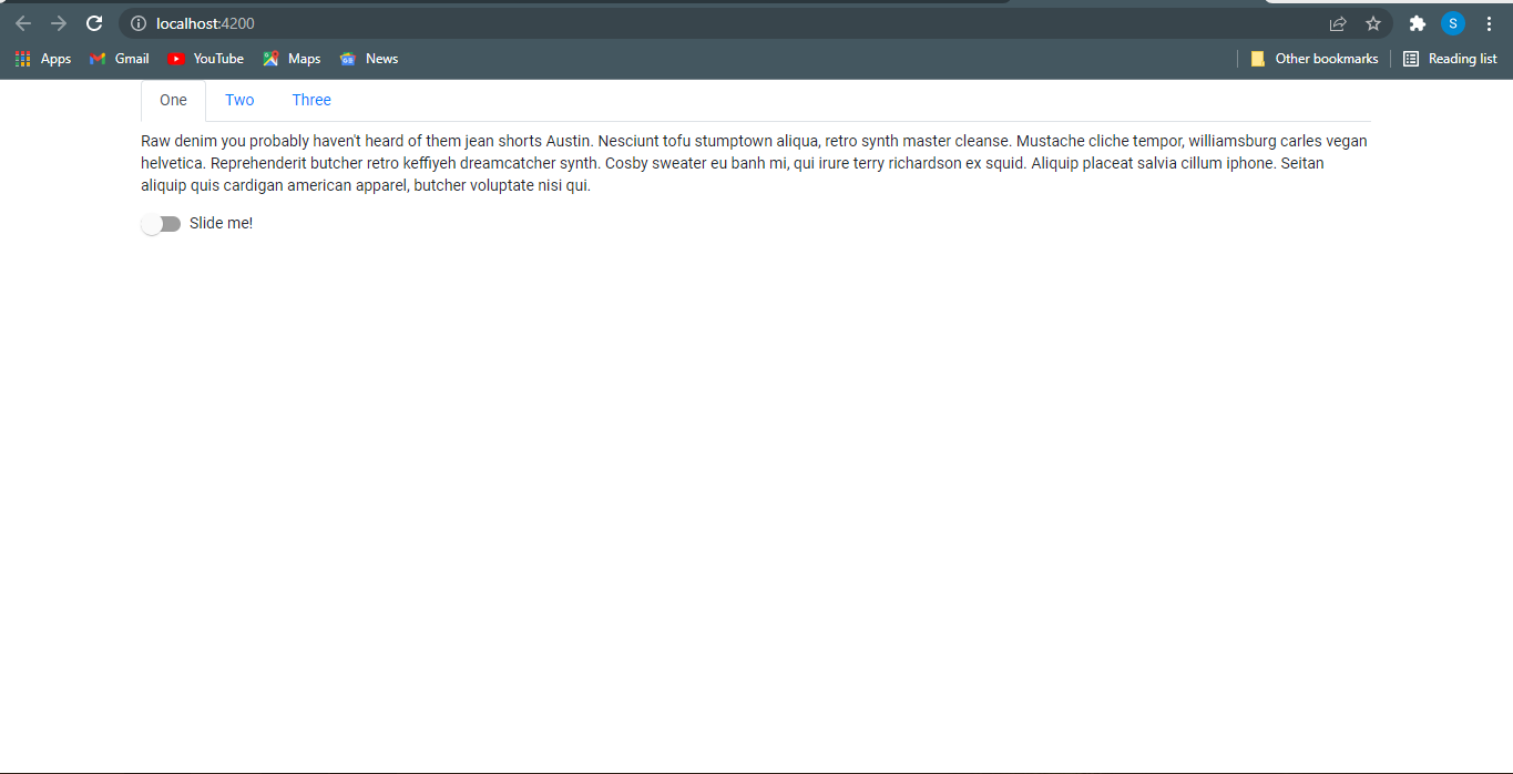
Here in the above image ‘one’, ‘two’, ‘three’ are navigation items, and below is an angular material slider. There are plenty of different components available on ng-bootstrap.
NGX-Bootstrap:
The Ngx-Bootstrap is one of the very popular libraries that is required to use bootstrap components in Angular Based projects. It consists of almost all core components of Bootstrap.
Ngx bootstrap is an open-source tool. It is an independent project, and the development is still ongoing. The original JavaScript component can be excluded, and just the markup and CSS framework provided by Bootstrap can be used in the projects.
The components of ngx-bootstrap are known to be modular, extensible, and adaptable.
Let’s start with the installation of ngx bootstrap.
ng add ngx-bootstrap
It will install ngx-bootstrap for the default application specified in your angular.json. The next step is to verify and check any component of the library. This time I’ll choose the alert component of ngx-bootstrap and use it in the project. To use the alerts component of this library first we need to install that component manually and then we’ll be able to use it in our application. For every component of ngx-bootstrap we need to install them separately by their specific commands. For alerts following command will run:
ng add ngx-bootstrap --component alerts
This will automatically import the recently installed component in app.module.ts as follows:
import { AlertModule } from 'ngx-bootstrap/alert';

@NgModule({
declarations: [
      AppComponent
],
imports: [
       …,
       AlertModule.forRoot()
 ],
 providers: [],
 bootstrap: [AppComponent]
})
export class AppModule { }
AlertModule is the module of the alert component of ngx-bootstrap. There are plenty of other components available on ngx-bootstrap.
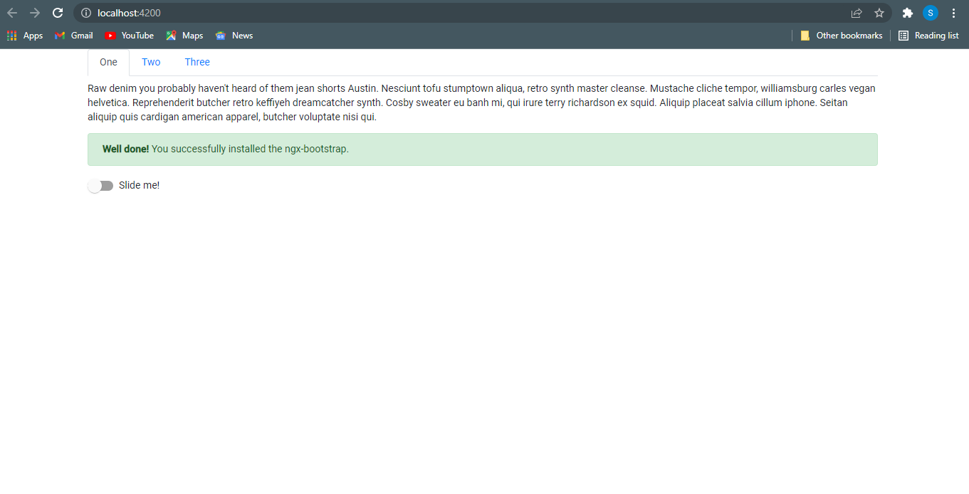
Let’s verify on our localhost whether our changes are reflected or not. Yes we are all done with ngx-bootstrap and alert-success message is showing here:
PrimeNG:
PrimeNG is a free and open-source library of UI components. It is developed by PrimeTek Informatics. PrimeNG provides 80+ UI components in a single library, so there would be no need to add any other library for different UIs. It includes all UI components like Datatable, Breadcrumbs, Input, Accordion, Notification message box, Multimedia, Menu, etc.
Let’s install PrimeNG in our Angular application by using the following command:
npm install primeng --save

npm install primeicons --save
UI components are configured as modules, once PrimeNG is downloaded and configured, modules and APIs can be imported from primeng/{module} shorthand in your application code. Documentation of each component states the import path. Let’s use the button module to verify the primeng installation. For that, we need to import ButtonModule in app.module.ts.
import {ButtonModule} from 'primeng/button';
To display the primeng button I am using app.component.html.
<p-button label="PrimeNG"></p-button>
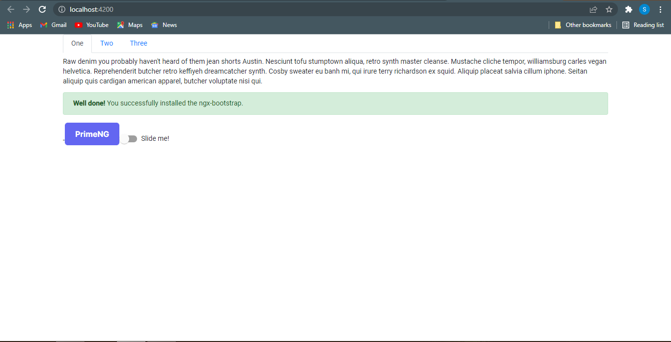
Our output on localhost is as follows:
Here as you can see we have a simple button, not a fancy button. To use CSS of components we need to update angular.json file by adding the following lines in style value:
node_modules/primeicons/primeicons.css
node_modules/primeng/resources/themes/lara-light-indigo/theme.css
node_modules/primeng/resources/primeng.min.css
After applying the above CSS we can see the fancy button as expected as follows:
In this way, we have done installing and used the primeng library in our project. There are plenty of different components available on PrimeNg.
MD Bootstrap:
MDBootstrap simply means Material Design Bootstrap; it is an extended version of the original Bootstrap CSS framework. It is a version of Bootstrap inspired by Material Designs. MDBootstrap takes Bootstrap a step further with more awesome styles and CSS effects that can be integrated into your Angular App. 1.1 million professionals already use MDBootstrap solutions – the company’s clients include organizations such as NASA, Amazon, Nike, Samsung, Airbus, IKEA, and General Electric. Young entrepreneurs created a company without the help of investors.
To install md bootstrap in the angular application we need to run the following command:
npm install angular-bootstrap-md --save
It will install MDBootstrap for the default application specified in your angular.json and import MDBBootstrapModule from MDBootstrap in app.module.
import { MDBBootstrapModule } from 'angular-bootstrap-md';
@NgModule({
  declarations: [
AppComponent
  ],
  imports: [
…,
     MDBBootstrapModule.forRoot()
  ],
  providers: [],
  bootstrap: [AppComponent]
})
export class AppModule { }
Let’s verify the installation of MDBootstrap, I am using the card component. To use css of the components we need to include the following command in the style attribute of angular.json:
node_modules/angular-bootstrap-md/assets/scss/bootstrap/bootstrap.scss
node_modules/angular-bootstrap-md/assets/scss/mdb.scss
The HTML for the card component is as follows:
 <div class="card">
          <img
          src="https://mdbootstrap.com/img/new/standard/nature/184.webp"
          class="card-img-top"
          alt="..." height="150px"
     />
     <div class="card-body">
       <h5 class="card-title">Card title</h5>
       <p class="card-text">
     Some quick example text to build on the card title and make up the bulk of the
         card's content.
       </p>
       <a href="#!" class="btn btn-primary">Button</a>
     </div>
   </div>
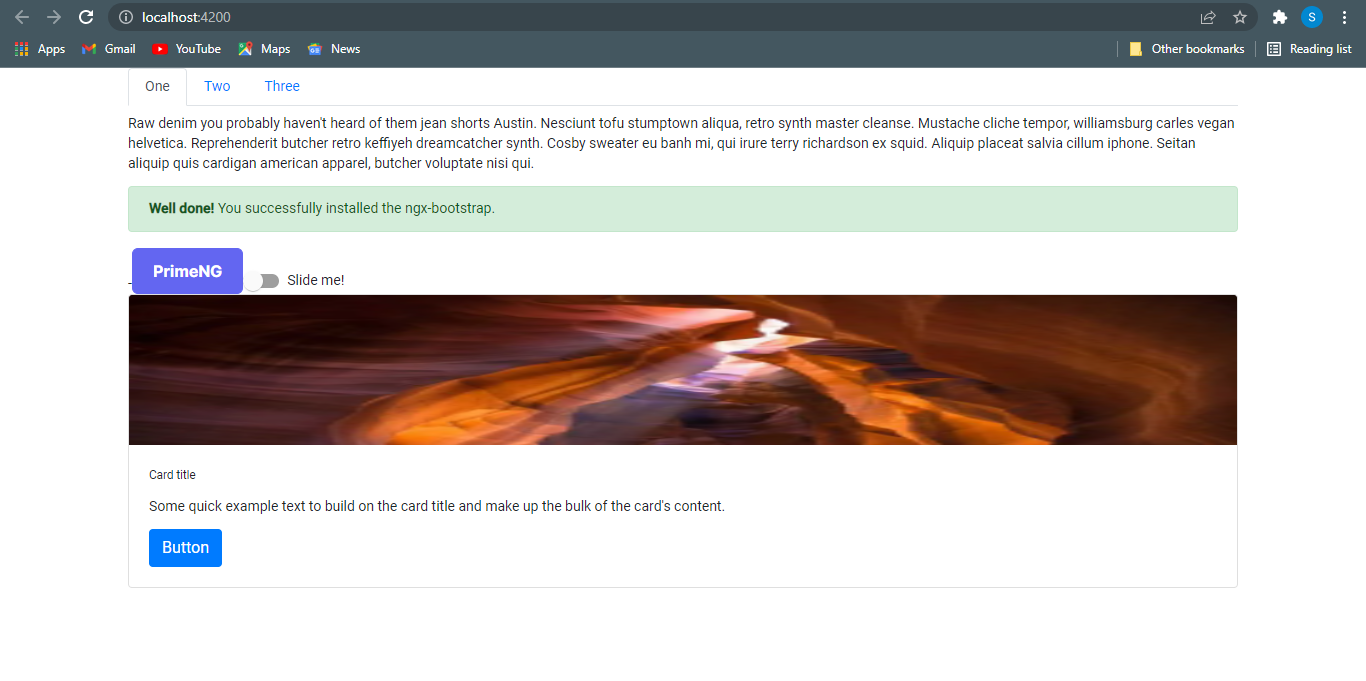 As you can see now we are able to see the card component of MDBootstrap. There are many other components available here in this library.
Conclusion:
The Angular component libraries mentioned here are the most relevant ones available in the market, keeping the current scenario. You can start using them in your project to get the best user experience. There are many popular and successful Angular websites that are using this elite JS framework and its libraries in such a perfect way. You can also choose the best ones according to the requirements of your project.
All code is available on our Github profile.
Issues:
from the list of angular component libraries, tell the user what are the core important/unique component or feature this library is providing.
How do these libraries save time, and do these components provide customizations? we can’t just use components and publish them, we have to change them according to our needs.
discuss the comparison of different libraries related to UI/UX
Give a reason to choose a specific library.
try to write things to the point
no need to write all the code which users can find easily from official documentation, such as you have given an example of mat slider module, it is well explained in the documentation
These are some of the key points, there are other points as well which we can write which you have to research.
search top angular component libraries and read some articles. you will get an idea of what to do.
