
Table of Contents
GrapesJS is a Free and Open Source Web Builder Framework that provides an extensive set of HTML elements from which you can build HTML templates without any knowledge of coding. You can see a demo, and you can add new building blocks according to your need. GrapesJS was designed to create dynamic templates faster and easier.
This post is about to give you an idea of what is Grapesjs and how you can extend it to build your own web builder. You will get to know how to do initialization and how can you add different blocks and components, how you can use built-in component types and create your own custom types, and also how to style your components.
Initialization:
First, you have to install grapesjs and then initialize the editor.
<link rel="stylesheet" href="path/to/grapes.min.css">
<script src="path/to/grapes.min.js"></script>

<div id="gjs"></div>

<script type="text/javascript">
  var editor = grapesjs.init({
      container : '#gjs',
      plugins: ['grapesjs-preset-webpage', customBlocks, customTypes]
  });
</script>
Plugins:
Containing all the building blocks which you can use to make Html templates, grapesjs-preset-webpage is a dependency that provides the default building blocks of grapesjs. You can also make your own plugins as well with a unique name and that name can’t be used by other plugins. You can also pass the custom values to your plugins as we passed to the ‘my-custom-plugin’ in the above code.
export default grapesjs.plugins.add('my-custom-plugin', (editor, options) => {
 console.log(options);
 //{ fieldName: 'fieldValue' }
})
In this way, you can add your own plugins and access the custom values which we passed while declarations of plugin and pluginOpts.
Blocks:
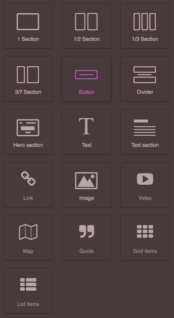
Block is a group of components that you can easily drag and drop in the editor canvas and you are able to remove, copy and move that block inside the canvas. GrapesJS provides built-in blocks but you can also make your own custom blocks using BlockManager. e.g.
const myFirstBlock = editor = {
 var blockManager = editor.BlockManager;
 // 'my-first-block' is the ID of the block
 blockManager.add('my-first-block', {
  label: 'Button',
  content: {
    type: button,
    tagName: 'button',
    draggable: false,
    attributes: { class: 'container'},
    style: { 'background-color': '#ffffff' },
    content: "Change Title",
  }
 });
}
In this way, you can make your own custom blocks and add different attributes to them. You can also set default styling and different attributes such as draggable: false. After creating blocks you have to add the block name to plugins array at the time of initializing the editor. e.g.
 var editor = grapesjs.init({
      container : '#gjs',
      plugins: ['grapesjs-preset-webpage', myFirstBlock ]
 });
Now our first block has been added to the editor at the end of collections as you can see in the screenshot below.
You can also update existing blocks e.g.
blockManager.get('my-first-block').set({
  label: 'Updated simple block',
  attributes: {
    title: 'Updated title'
  }
})
Component:
Each element you dropped in the canvas is transformed into a GrapesJS component. You can also add different components in a block you can nest components as much as you can, and then rearrange the element with the help of the editor. Grapesjs editor provides the ability to see the HTML and CSS code structure and you can also see designs on different screen sizes to check responsiveness.
{
  tagName: 'div',
  components: [
    {
      type: 'image',
      attributes: { src: 'https://path/image' },
    }, {
      tagName: 'span',
      style: {
       'background-color': '#ffffff',
       'font-family': 'Ubuntu, sans-serif',
      },
      type: 'text',
      attributes: { title: 'foo' },
      components: [{
        type: 'textnode',
        content: 'Hello world!!!'
      }]
    }
  ]
}
Component Type:
You can use built-in types for elements and also create custom types and can customize accordingly in the following way.
editor.DomComponents.addType('my-cusotm-type', {
  isComponent: el => el.tagName === 'INPUT',

  // Model definition
  model: {
    // Default properties
    defaults: {
      tagName: 'input',
      draggable: 'form, form *', // Can be dropped only inside `form` elements
      droppable: false, // Can't drop other elements inside
      attributes: { // Default attributes
        type: 'text',
        name: 'default-name',
        placeholder: 'Insert text here',
      },
      traits: [

           // discussed in the below sections.
      ],
    }
  }
});
isComponent method receives a parsed HTMLElementNode which makes the editor understand when to apply my-custom-type. The model property holds the description of your component and you can access all the child elements through the model and modify it. You have to add custom types in the plugin array as we did for blocks during initialization. You can also update component types using the AddType method.
You can also add event listeners on props or attribute changes in the init function and trigger functions on changes while adding custom types. e.g.
editor.DomComponents.addType('my-custom-type', {
  // ...
  model: {
    defaults: {
        // defined above
    },

    init() {
      // Listen to any attribute change
      this.on('change:attributes', this.handleAttrChange);
      // Listen to title attribute change
      this.on('change:attributes:title', this.handleTitleChange);
    },

    handleAttrChange() {
      console.log('Attributes updated: ', this.getAttributes());
    },

    handleTitleChange() {
      console.log('Attribute title updated: ', this.getAttributes().title);
    },
  }
});
After initializing, you can get a component instance, that instance will be responsible for the final data of your template which you can use and change accordingly. e.g.
const components = editor.getComponents()
Then you can find your required component based on its type, attributes, or identifiers.
You can use different methods such as getAttributes, setAttributes, etc.
const componentHTML = component.toHTML();
const componentType = component.get('type'); // eg
Each component triggers a lifecycle hook method based on the actions such as triggering the updated hook method when the model is updated and triggering the removed hook method when the model is removed.
Component Type Stack:
In GrapesJs when we pass HTML to the editor, it is compiled as a component with a new type. The component type stack is an array of component types, and the newly added type goes on top of the stack. Each element iterates the stack from top to bottom to find the appropriate type which is returned by the isComponent method.
Model:
Once the component is ready an appropriate type is assigned to the component known as the model or component instance.
Lifecycle Hooks:
Each component triggers different lifecycle hooks, which allow you to listen to certain events and perform an action at different stages. There are two types of hooks which are local and global. You have to define local hooks when you create components and global hooks will be called on any component via editor. on.
Local hook are model.init(), view.init() executed once the component is initialized
Global hooks are component:create, component:update
AssetsManager:
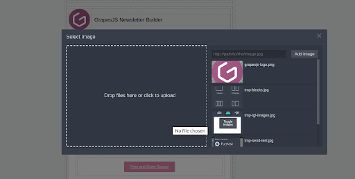
GrapesJs provides an asset manager that you can use to upload images and also select the default image as well.
const editor = grapesjs.init({
 ...
 assetManager: {
   assets: [
    'http://placehold.it/350x250/78c5d6/fff/image1.jpg',
    // Pass an object with your properties
    {
      type: 'image',
      src: 'http://placehold.it/350x250/459ba8/fff/image2.jpg',
      height: 350,
      width: 250,
      name: 'displayName'
    },
   ],

  upload: 'https://endpoint/upload/assets',
 }
});
In this way, you can initialize your AssetManager. When you drag an image from the block manager it will open a popup for you from where you can select your images or upload new images. You can also define your upload endpoints in the upload property as we did in the above code block, where new images will be saved.
GrapesJs also provides the event listener for upload start, upload end, and upload error. Which you can listen to perform your operations.
editor.on('asset:upload:start', () => {
});
// The upload is ended (completed or not)
editor.on('asset:upload:end', () => {
});
// Error handling
editor.on('asset:upload:error', (err) => {
});
// Do something on response
editor.on('asset:upload:response', (response) => {
});
You can also add assets programmatically in runtime, and there are many other operations as well that you can perform using asset managers such as removing assets, getting all the assets.
const am = editor.AssetManager;
am.add([
 {
   src: 'http://placehold.it/350x250/78c5d6/fff/image1.jpg',
 },
])
am.render();
Panels:
GrapesJs provides a Panel from which you can perform actions.
This is the GrapesJS default Panel from which you can clear canvas, preview web pages, see HTML and CSS code, and perform some other actions.
When you click on the panel button GrapesJS executes the command which we have discussed above.
If you are extending GrapesJS, you may need to add new options in the Panel. Let’s add a new button in the Panel.
editor.Panel.addButton('views', {
     id: 'sign-out',
     label: 'Sign Out',
     className: 'fa fa-sign-out', // button icon
     command: {
       run: () => {
         // When sign-out button is clicked, this command will be   executed;
         signOut()// sign out the user from system
       }
     },
  });
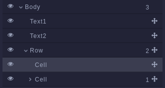
LayerManager:
Grapesjs also provides the ability to manage the HTML node tree structure. You can easily see the parent and child of each node or HTML element, and you can easily change the position of the node through the layer manager using drag and drop which makes it easier to manage the tree structure. You just have to specify where you want to render your layer manager during initialization.
layerManager: {
   appendTo: '.layers-container'
},
Looking to hire a Grapesjs Development team
Share the details of your request and we will provide you with a full-cycle team under one roof.
This is the tree overview of the structured nodes and it is also showing the count of child nodes.
StyleManager:
GrapesJS provides a StyleManager module, which helps you to style any component that is present in the canvas.
styleManager : {
    sectors: [{
      name: 'Dimension',
      buildProps: ['width', 'min-height']
    }]
}
You can add any CSS property in the build props array, and then apply it to blocks using the editor.
Through the component model, you can change and get the style of every component.
const models = editor.getComponents().models
 model.addStyle({
    'height': '50px',
 });
const style = model.getStyle();
StyleManager also allows you to set CSS for different states such as hover, and active using the editor and you can also change CSS for the hover state dynamically with the CssComposer module.
const id = model.getId();
editor.CssComposer.setRule(`#${id}:hover`, { 'color': 'red'  });
Traits:
Traits are the element attributes such as title, placeholder, checkbox, and dropdown. The common use of traits to give access to users to set attributes of components such as placeholder, and title. You can bind different input traits on elements and react to change. You need to write the following code to add custom traits and retain existing trait functionality.
domComponents.addType('my-custom-type', {
         model: {
           defaults: {
             traits: [  ...domComponents.getType('my-custom-type').model.prototype.defaults.traits, // to retain default traits
               {
                 type: 'select',
                 label: 'Custom Trait',
                 name: 'custom_trait',
                 options: [
                     { value: '', name: 'None' },
                     { value: 'Js', name: 'Javascript}
                 ]
               }
            ],
         }
      }
 });
You can also listen to an event when the trait value changes of a component. You have to add an event listener while creating components like this.
domComponents.addType('my-custom-type', {
 model: {
   defaults: {
     ...
   }
 }
 init() {
   this.on('change:custom_trait', this.handleValueChange);
 },
 handleValueChange() {
   console.log('Value changes');
 },
});
Every time the custom_trait value changes, handleValueChange will be triggered.
Device Manager:
You can also view your HTML pages on different screen sizes using device managers to make responsive templates.
deviceManager: {
       devices:
       [
         {
           id: 'desktop',
           name: 'Desktop',
           width: '',
         },
         {
           id: 'tablet',
           name: 'Tablet',
           width: '768px',
           widthMedia: '992px',
         },
         {
           id: 'mobilePortrait',
           name: 'Mobile portrait',
           width: '320px',
           widthMedia: '575px',
         },
       ]
     },
By default GrapesJS provides three devices, you can override them and add new devices according to your needs. You can also trigger events when the device changes and also get the currently selected device.
editor.on('change:device', () => {
  console.log('Current device: ', editor.getDevice()
});
StorageManager:
After making your HTML pages, you need to save your pages and load them again when you want to change your templates. Grapesjs covers this important feature as well. By default, Grapesjs saves the data in local storage.
storageManager: {
       id: 'gjs-', // Prefix identifier that will be used inside storing and loading
       type: 'local',
       autosave: true,
       storeComponents: true,
       storeStyles: true,
       storeHtml: true,
       storeCss: true,
},
Other than that you can get the HTML and CSS of your template and save them wherever you want using these functions.
Html = editor.getHtml();
Css = editor.getCss();
You can load HTML and CSS using these functions.
editor.setComponents(Html);
editor.setStyle(Css);
SelectorManager:
Selector Manager allows you to reuse style across all the components, exactly the same as what classes do in the HTML. It shows all the applied classes of selected components. And you can add new classes with the help of grapesjs interface.
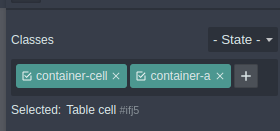
When you change the styling of the selector, it will change all the styling of all the components which contain this selector. If you want to target a single selected component you have to set the Component-first selector property to true.
const editor = grapesjs.init({
 // ...
 selectorManager: {
   componentFirst: true,
 },
});
Theming:
You can improve the theme of the editor for better visual representations by changing a few CSS rules. You can change the primary, secondary, and other hover state colors by overriding the default CSS rule, if you want to change the primary color for the background you just need to write the following CSS.
/* Primary color for the background */
.gjs-one-bg {
  background-color: #78366a;
}
Events:
Event Listeners are most frequently used in Javascript which we can use to perform specific tasks when the event occurs. GrapesJS provides multiple events which you can register with the help of the editor instance. If you want to override the existing functionality of GrapesJS you would need to find out when the GrapesJS has completely loaded, otherwise, it wouldn’t work.
GrapesJS triggers the event when the loading is complete, you can listen to it in the following way with the help of the editor instance:
editor.on('load', () => {
     let styleManager = editor.StyleManager;
     let fontProperty = styleManager.getProperty('typography',  'font-family');
     fontProperty.set('defaults', 'Roboto');
     styleManager.render();
});
GrapesJS applies the default font family of ‘Ubuntu’. If you want to change this font family according to your requirements, then you have to register the load event and have to change the default font family to ‘Roboto’ with the help of StyleManager as you can see in the above code block.
There are other events as well you can use according to your needs, such as:
- Component Create Event
- Component Update Event
- Style Update Event
- Property Update Event
Commands:
GrapesJS provides a set of commands, which are functions that can be used across the editor cycle. Grapesjs provides a set of default commands that we can use and extend. We can make our custom commands as well. Once the command is executed, nothing is left behind just like a simple function. But grapesJS provides a feature of stateful commands from which you can find out what was the last returned value from the command. For stateful commands, you have to use both run() and stop() methods.
If you want to clear canvas, Grapes provides a command, you have to run the following code:
editor.runCommand('canvas-clear');
‘canvas-clear’ is the default command of GrapesJS. If you want to extend the default command, you can do it in the following way:
editor.Commands.add('canvas-clear', editor => {
    editor.DomComponents.clear();
    editor.CssComposer.clear();
});
You can add your own functionality in the above code block. For custom commands use the following pattern:
editor.Commands.add('custom-command', {
   run(editor) {
    alert(`Command is active`)
     return “Grapesjs”
   }
   stop(editor) {
     alert(`Command is disabled`)
   }
})
editor.runCommand('custom-command');
console.log(editor.Commands.getActive()); //return “Grapesjs” which is last return value of command
editor.stopCommand('custom-command') // stop command
Modal:
Grapes js also provides the modal feature which can be used for popups. You can easily display the modal using the editor instance.
editor.Modal.open({
 title: 'My title', // string | HTMLElement
 content: 'My content', // string | HTMLElement
 attributes: {
   class: 'my-modal',
 },
});
You can apply custom classes to modal using attributes property.
It also provides the event listener from which you can find out about the modal states.
// Close the modal
Modal.close();
// Check if the modal is open
Modal.isOpen();
// Update title
Modal.setTitle('New title');
// Update content
Modal.setContent('New content');
// Execute one-time callback on modal close
Modal.onceClose(() => {
console.log('My last modal is closed');
});
Grapesjs also provides a way to replace existing modals with your custom modal using property.
const editor = grapesjs.init({
 // ...
 modal: { custom: true },
});
editor.on('modal', props => {
 // The `props` will contain all the information you need in order to update your custom modal.
 // props.open (boolean) - Indicates if the modal should be open
 // props.title (Node) - Modal title
 // props.content (Node) - Modal content
 // props.attributes (Object) - Modal custom attributes (eg. class)
 // props.close (Function) - A callback to use when you want to close the modal programmatically
 // Here you would put the logic to control your modal.
});
Internationalization:
By default, the editor provides the English language. If you want to change you have to do it manually.
import grapesjs from 'grapesjs';
import it from 'grapesjs/locale/it';
const editor = grapesjs.init({
 ...
 i18n: {
   // locale: 'en', // default locale
   // detectLocale: true, // by default, the editor will detect the language
   // localeFallback: 'en', // default fallback
   messages: { it},
 }
});
With the above configuration, the editor will be translated into Italian for those browsers whose default language is Italian.
Replace the built-in Rich Text Editor:
You might have noticed grapes js provides a tiny rich text editor with limited options as you can see in the picture below.
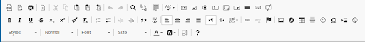
Instead of adding new options in the existing editor, we can completely replace it with the new one. We can use CKEditor to use more features for text styling which is also provided by grapes js, it provides more features than the existing rich text editor.
This is how you can configure ckeditor in grapes js. First, you have to install this plugin using this command:
npm i grapesjs-plugin-ckeditor
var editor = grapesjs.init({
 ...
 plugins: ['gjs-plugin-ckeditor']
 pluginsOpts: {
   'gjs-plugin-ckeditor': {
     options: {
       language: 'en',
       extraPlugins: 'colorbutton,colordialog',
       autoParagraph: false,
       enterMode: 2,
       toolbar: [
         { name: 'styles', items: ['Format' ] },
         { name: 'basicstyles', items: ['Bold', 'Italic', 'Underline', 'Strike'], },
         { name: 'paragraph', items: ['NumberedList', 'BulletedList', '-', 'Outdent', 'Indent', '-', 'Blockquote' ] },
         { name: 'colors', items: [ 'TextColor', 'BGColor' ] },
         { name: 'clipboard', items: ['Undo', 'Redo' ] },
       ]
     }
   },
 }
});
As you can see in the above options, we have a lot of options in ckeditor. We can simply remove or add options from the toolbar, and we can also set the position of the toolbar.
These are the options you can have using ckeditor:
Moreover, GrapesJS provides a lot more features that can make your life easier by minimizing the codebase.
