
Table of Contents
In this article, we will learn to build custom blocks in grapesjs of the content created in the canvas and then add them to our block lists using Block Manager. Furthermore, we will see how to add a command on the toolbar which appears after selecting some component.
Background:
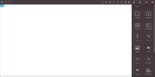
If you are new to GrapesJS, reviewing this article: Extend GrapesJs to build your Own Web Builder Framework is first recommended. The project we build in this tutorial will be in Angular. The initial setup of GrapesJS is already done in the Angular project and the editor is also initialized with the gjs-preset-webpage plugin. The below screenshot represents the view from which we will move onward.
If you want to learn how this is done, you can check the article: Integration of GrapesJs with Angular Framework and then continue reading this article further.
What Will be Learning:
So the purpose of this article is to create the blocks dynamically for any template formed in the canvas and then add them to our block lists using BlockManager. The block in GrapesJS is just a reusable piece of HTML that you can drop into the canvas. A block can be an image, a button, or an entire section with videos, forms, etc. For this purpose, we will require the HTML and CSS of the content or template created in the canvas for which we want to create the block. We will be adding a command on the toolbar of the components and upon clicking it ngx-smart-modal will open up which is a node package that will ask the name of the block we want to create. So we will also see how to make that modal and use that package in our project. Let’s move towards the actual part of coding the whole thing.
Adding a Command on the Toolbar:
First of all, we will write code to add a command on the toolbar whenever a component is selected in the canvas. The below code can be added in the ngOnInit method after the editor is initialized. Whenever a component is selected in the canvas the component: the selected event is triggered. We extract the existing toolbar commands and then add our command icon to it if it does not already exist. We make the icon using font awesome which is an online website that provides several icons of different shapes. Upon clicking that icon, a modal will open that will ask for the name of the block and then create that block. For now, the code in the function commandBlockTemplate is commented on as we have not yet made that modal and appended a form in it. Add the below code in your file to add an icon in the toolbar to create custom blocks.
   this.editor.on('component:selected', (editor:any) => {
     // whenever a component is selected in the editor
     if (!this.editor) {
       this.editor = editor
     }
     const selectedComponent = this.editor.getSelected();
     if (selectedComponent && selectedComponent.attributes) {
       //createBlockTemplate functionality
       const commandBlockTemplateIcon = 'fad fa-square'
       const commandBlockTemplate = () => {
        // this.modalService.getModal('createBlockTemplate').open(); //Commented for          ………………… now as we have not made Modal yet
       }
        const defaultToolbar = selectedComponent.get('toolbar');
       const commandExists = defaultToolbar.some((item:any) => item.command.name === 'commandBlockTemplate');
        if (!commandExists) {
         selectedComponent.set({
           toolbar: [ ...defaultToolbar, {  attributes: {class: commandBlockTemplateIcon}, command: commandBlockTemplate }]
         });
       }
     }
  });
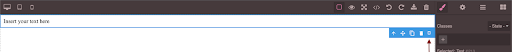
You can see the command icon on the toolbar in the below screenshot with the pointed arrow.
Building a Modal:
Let’s first install the package and add bootstrap in our project for styling by executing the below-given commands and import it into your component file and also in the app.module.ts file.
Commands:
npm i ngx-smart-modal
ng add @ng-bootstrap/ng-bootstrap
Import Statements in app.module.ts:
import { NgModule } from '@angular/core';
import { BrowserModule } from '@angular/platform-browser';

import { AppComponent } from './app.component';
import { CustomBlockComponent } from './custom-block/custom-block.component';
import { FormsModule, ReactiveFormsModule } from '@angular/forms';
import { NgxSmartModalModule } from "ngx-smart-modal";
import { NgbModule } from '@ng-bootstrap/ng-bootstrap';

@NgModule({
 declarations: [
   AppComponent,
   CustomBlockComponent
 ],
 imports: [
   BrowserModule,
   FormsModule,
   ReactiveFormsModule,
   NgxSmartModalModule.forRoot(),
   NgbModule
 ],
 providers: [],
 bootstrap: [AppComponent]
})
export class AppModule { }
Import statement in component.ts file:
import {NgxSmartModalService} from 'ngx-smart-modal';
import {FormBuilder, Validators} from '@angular/forms';
Now, let’s make a form that will be shown in the modal when it opens up. Declare the below statements in your Components class.
export class CustomBlockComponent implements OnInit {
 public editor:any = null
 blockTemplateForm = this.formBuilder.group({
   name: ['', Validators.required]
 })
Add the below code in your component’s HTML file that makes a modal. On submitting the form createBlockTemplateConfirmation() function will be triggered and for now, make an empty function in your typescript file so that the code doesn’t break.
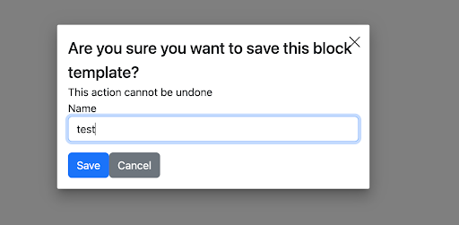
<ngx-smart-modal #createBlockTemplate (onAnyCloseEvent)="createBlockTemplate.close()" customClass="nsm-centered"
                identifier="createBlockTemplate">
 <div class="modal-header">
   <h4 class="modal-title"> Are you sure you want to save this block template? </h4>
 </div>
 <div class="modal-body">
   <div>This action cannot be undone</div>
 </div>
 <form (ngSubmit)="createBlockTemplateConfirmation()" [formGroup]="blockTemplateForm" >
   <!-- <app-form-errors [errors]="formErrors()"></app-form-errors> -->
   <div class="col-sm-12 form-group mb-3">
     <label for="name">Name</label>
     <input id="name" type="text" class="form-control" formControlName="name"/>
     <!-- <app-field-errors [errors]="fieldErrors('name')"></app-field-errors> -->
   </div>
   <div class="modal-footer">
     <div class="col-sm-12 form-group page-form-controls">
       <button type="submit" [disabled]="!blockTemplateForm.valid" class="btn btn-primary">Save</button>
       <button (click)="createBlockTemplate.close()" class="btn btn-secondary" type="button">Cancel</button>
     </div>
   </div>
 </form>
</ngx-smart-modal>
Add the below styles to the modal in the styles.css file:
/* You can add global styles to this file, and also import other style files */
/* You can add global styles to this file, and also import other style files */
@import "~ngx-smart-modal/ngx-smart-modal.css";

.nsm-dialog.nsm-centered {
 display: grid;
}
.nsm-dialog-lg {
 max-width: 980px;
}
.nsm-dialog-xl {
 max-width: 1200px;
}
.nsm-dialog-xxl {
 max-width: 1500px;
}
.nsm-dialog-full {
 max-width: 100%;
}
Furthermore, uncomment the below command function line which was commented previously in the component:selected event.
       const commandBlockTemplate = () => {
        this.modalService.getModal('createBlockTemplate').open();
       }
This type of Modal will pop up on clicking the square box in the toolbar of the selected component.
As we are done making the command, modal, and form in it, let’s move towards the main part of making the custom blocks of any type of content made on the canvas when we click on the Save button.
Looking for a Grapesjs Development Team?
Share the details of your request and we will provide you with a full-cycle team under one roof.
Making Custom Blocks in Grapesjs:
Write the below code in the component.ts file after the ngOnInit method which will be triggered on clicking the Save button.
 createBlockTemplateConfirmation () {
   const selected = this.editor.getSelected();
   let name = this.blockTemplateForm.get('name')!.value
   let blockId = 'customBlockTemplate_' + name.split(' ').join('_')
   let name_blockId = {
     'name': name,
     'blockId': blockId
   }

   createBlockTemplate(this.editor, selected, name_blockId)
   this.blockTemplateForm.reset();
   this.modalService.getModal('createBlockTemplate').close();
 }
The function will get the selected component and the provided name from the form and will pass them to the createBlockTemplate function. The createBlockTemplate function will then find the HTML and CSS of the selected components using some other written functions. After that, it will make a block of it and add it to the block lists using the Block Manager. The HTML of the parent component and all child components are found using the selected.getEl().outerHTML function provided by grapesjs. The CSS of the components is found with the help of a recursive function to find the CSS of child components as well which is made on the canvas. These functions are written in a separate file (index.ts) in the app/_helpers/grapesjs folder. Below is the code of the index.ts file:
export const getCss = (editor, id) => {
 const style = editor.CssComposer.getRule(`#${id}`);
 const hoverStyle = editor.CssComposer.getRule(`#${id}:hover`);

 if (style){
   if(hoverStyle){
     return style.toCSS() + ' ' + hoverStyle.toCSS()
   }
   return style.toCSS()
 }
 else {
   return ''
 }
}

  export const findComponentStyles = (editor:any,selected:any) => {
   let css =''
   if (selected){
     const childModel =  selected.components().models
     if (childModel) {
       for (const model of childModel) {
         css = css + findComponentStyles(editor,model)
       }
       return css+ getCss(editor, selected.getId());
     }
     else{
       return getCss(editor, selected.getId());
     }
   }
 }
  export const createBlockTemplate = (editor:any, selected:any, name_blockId:any) => {
   const bm = editor.BlockManager
   const blockId = name_blockId.blockId;
   const name = name_blockId.name;

   let elementHTML = selected.getEl().outerHTML;
   let first_partHtml = elementHTML.substring(0, elementHTML.indexOf(' '));
   let second_partHtml = elementHTML.substring(elementHTML.indexOf(' ') + 1);
   first_partHtml += ` custom_block_template=true block_id="${blockId}" `
   let finalHtml = first_partHtml + second_partHtml
   const blockCss = findComponentStyles(editor,selected)
   const css = `<style>${blockCss}</style>`
   const elementHtmlCss = finalHtml + css

   bm.add(`customBlockTemplate_${blockId}`,{
     category: 'Custom Blocks',
     attributes: {custom_block_template:true},
     label: `${name}`,
     media: '<i class="fa fa-square"></i>',
     content: elementHtmlCss,
   })
 }
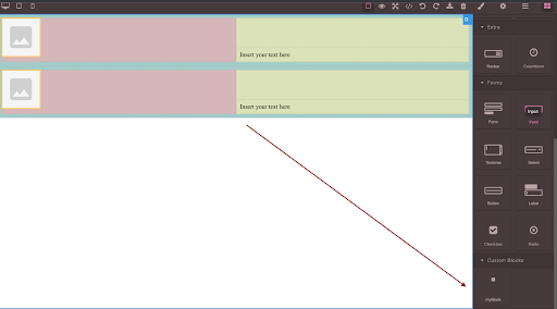
The below screenshot represents the final output and a custom block that was created and added in the blocks panel.
This is to note that the custom block added will be lost once the page reloads. The HTML and CSS need to be saved in the database like PostgreSQL and configuring a backend with it so that the block can be added again when the page reloads. Custom blocks are useful in case you want to reuse your custom blocks in different website designs if you are using GrapesJS as your web builder framework.
